The Whiteboard That Broke
Every UX researcher has lived this moment. You have 23 interview transcripts, 400 open-ended survey responses, and a deadline in four days. You buy a pack of sticky notes, book the largest conference room, and start the ritual: write one insight per note, stick it on the wall, step back, squint, group, regroup, label, argue with a colleague about whether "confused by pricing" belongs in the "onboarding friction" cluster or the "value perception" cluster.
By hour three, you have a wall of colorful paper, a sore back, and the creeping realization that you are only through a third of the data. The rest will get skimmed, cherry-picked, or ignored entirely.
This is the dirty secret of affinity mapping. The method itself is brilliant — Jiro Kawakita's KJ Method from the 1960s remains one of the most powerful bottom-up synthesis techniques in qualitative research. The problem is not the method. The problem is that affinity mapping does not scale, and modern research generates far more data than sticky notes can handle.
A 2025 benchmarking study across 340 research teams found that the average affinity mapping session covers only 38% of available qualitative data before time constraints force the team to stop. The remaining 62% gets a cursory review at best. That means your synthesis — the foundation for product decisions, strategy pivots, and roadmap priorities — is built on an incomplete picture.
It does not have to be this way.
Why Affinity Mapping Matters (And Why Shortcuts Kill It)
Before we talk about scaling the method, let us be clear about why affinity mapping is worth scaling in the first place.
The Bottom-Up Advantage
Most qualitative analysis methods are top-down. You start with a codebook — predefined categories based on your research questions — and sort data into those buckets. This is efficient but dangerous. Top-down coding finds what you are looking for. It misses what you are not.
Affinity mapping inverts this. You start with individual data points — observations, quotes, behavioral notes — and let patterns emerge from the data itself. Clusters form organically. Themes surface that no one anticipated. The method respects the data rather than forcing it into predetermined boxes.
This bottom-up quality is what makes affinity mapping indispensable for discovery research, where the whole point is to find things you did not know you were looking for. It is the reason continuous discovery teams rely on it for weekly synthesis.
What Gets Lost When You Cut Corners
When teams hit the scaling wall, they typically do one of three things:
- Sample the data. Analyze a subset and assume it is representative. But qualitative data is not quantitative — a single outlier insight can be more valuable than the modal response.
- Divide and conquer. Split the data among team members, each doing their own clustering, then merge. But different researchers make different grouping decisions, and the merge step introduces inconsistency that undermines the whole exercise.
- Skip to themes. Jump straight to high-level thematic coding instead of doing bottom-up affinity work. Faster, but you lose the emergent insights that make affinity mapping worth doing.
Each shortcut sacrifices the very quality that makes affinity mapping valuable: the ability to surface unexpected patterns from the full dataset.
How AI Changes the Equation
AI does not replace affinity mapping. It removes the bottleneck that prevents you from doing it properly.
Automated Clustering With Human Oversight
Modern language models can process thousands of qualitative data points and identify semantic clusters with remarkable accuracy. Research comparing AI-generated clusters to expert human groupings shows agreement rates of 0.76-0.83 (Cohen's kappa) — well within the range of inter-rater reliability between two experienced human coders.
At Qualz.ai, our analysis engine processes every data point in your dataset — interviews, survey responses, observation notes — and generates initial affinity clusters based on semantic similarity, not keyword matching. The difference matters. Keyword matching groups "the pricing was confusing" and "I found the prices unclear" together, which is trivial. Semantic clustering also connects "I had to ask my manager for budget approval before I could decide" to the pricing cluster — because the underlying theme is value communication, even though the words are entirely different.
The researcher's role shifts from the mechanical work of initial sorting to the interpretive work of reviewing, refining, splitting, and merging clusters. This is where human judgment is irreplaceable — AI finds patterns in language, but researchers understand context, nuance, and strategic significance.
Processing the Full Dataset
This is the most significant change. When AI handles the computational burden of initial clustering, there is no reason to analyze only 38% of your data. Every interview transcript, every open-ended response, every field note gets processed. The synthesis is built on the complete picture rather than a convenient subset.
For teams doing large-scale open-ended survey analysis, this is transformational. Five thousand verbatim responses that would take weeks of manual affinity work get clustered in minutes — with every data point accounted for and traceable to its source.
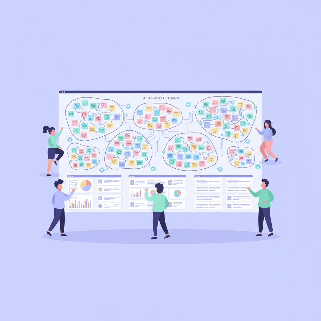
Multi-Level Hierarchy
Traditional affinity mapping produces two or three levels: individual notes → groups → super-groups. AI-assisted affinity mapping can generate richer hierarchies without additional effort:
- Level 1: Individual data points (quotes, observations)
- Level 2: Micro-clusters (tight semantic groupings, 3-8 data points each)
- Level 3: Themes (conceptual groupings of related micro-clusters)
- Level 4: Meta-themes (strategic-level patterns spanning multiple themes)
This multi-level structure gives teams flexibility. Product managers can work at the theme level for roadmap planning. Designers can drill into micro-clusters for specific interaction patterns. Executives can review meta-themes for strategic direction. Everyone is working from the same underlying data.
A Practical Framework: AI-Assisted Affinity Mapping in Five Steps
Theory aside, here is how to actually implement AI-assisted affinity mapping in your research practice.
Step 1: Data Preparation and Ingestion
Get all your qualitative data into a single platform. This sounds obvious, but research operations studies show that data fragmentation across tools is the number-one barrier to effective synthesis. Interview transcripts from Zoom, survey responses from Typeform, field notes from Google Docs — it all needs to live in one place.
In Qualz.ai, you can import transcripts directly, run AI-moderated interviews natively, and deploy surveys that feed directly into the same analysis pipeline. The goal is zero data migration friction.
Key decisions at this stage:
- Define the unit of analysis (full responses, individual sentences, or meaning units?)
- Tag data with metadata (participant segment, interview wave, data collection method)
- Decide on inclusion criteria — are you analyzing everything, or a defined scope?
Step 2: AI-Powered Initial Clustering
Run the AI clustering engine on your full dataset. At this stage, resist the urge to pre-specify categories. The whole point of affinity mapping is bottom-up emergence — let the algorithm find natural groupings.
The AI will generate initial clusters with:
- A proposed cluster label (descriptive, not evaluative)
- Member data points with similarity scores
- Cross-references to related clusters
- Outlier data points that do not fit neatly into any cluster
Expect the initial output to be imperfect. That is by design. If the AI could do perfect synthesis without human review, you would not need researchers.
Step 3: Human Review and Refinement
This is where the researcher earns their pay. Review each cluster for:
- Coherence: Do all data points in this cluster genuinely belong together, or has the AI grouped them on surface-level similarity while missing a meaningful distinction?
- Granularity: Is this cluster too broad (hiding meaningful sub-patterns) or too narrow (splitting what should be one theme)?
- Labeling: Does the AI-generated label capture the essence of the cluster? Rename freely — your labels will become the vocabulary your team uses to discuss findings.
- Missing connections: Are there data points in separate clusters that your domain knowledge tells you are related?
Split clusters that are too heterogeneous. Merge clusters that represent the same underlying phenomenon. Move data points that the AI misclassified. Create new clusters for patterns you see that the AI missed.
This step typically takes 2-4 hours for a dataset that would require 2-4 days of fully manual affinity mapping. The time savings come not from skipping interpretive work but from eliminating the mechanical sorting that consumed most of the traditional process.
Step 4: Hierarchical Organization
Once your refined clusters are solid, organize them into the multi-level hierarchy:
- Review cluster-to-cluster relationships
- Group related clusters into themes
- Identify meta-themes that span multiple themes
- Map the hierarchy to your research questions
This is where the strategic value emerges. Individual clusters tell you what users said. The hierarchy tells you what it means.
For example, you might find that three apparently unrelated clusters — "confused by feature naming," "could not find the setting I needed," and "asked support for help with something in the UI" — all roll up to a theme of "discoverability failure in the product surface." That theme connects to a meta-theme of "the product's mental model does not match user expectations," which has direct implications for product roadmap priorities.
Step 5: Validation and Output
Before finalizing your affinity map, validate it:
- Member checking: Do the clusters make sense to someone who was not involved in the analysis? Have a colleague or stakeholder review the top-level themes.
- Data saturation: Are there clusters with only 1-2 data points? These might be genuine outliers worth highlighting, or they might indicate incomplete data collection.
- Coverage: Use the platform's traceability features to verify that every data point in your dataset is accounted for — either assigned to a cluster or explicitly flagged as an outlier.
Export the final affinity map in whatever format your team needs: a visual diagram for workshop facilitation, a structured report for stakeholders, or a tagged dataset for further analysis. Diary study data particularly benefits from this structured output, since longitudinal data tends to be voluminous and complex.
When AI Affinity Mapping Works Best (And When It Does Not)
AI-assisted affinity mapping is not universally superior to traditional methods. Here is an honest assessment of where it excels and where it falls short.
Best For:
- Large datasets (50+ data points) where manual affinity mapping hits the scaling wall
- Multi-source synthesis combining interviews, surveys, and observational data
- Distributed teams that cannot physically gather around a whiteboard
- Rapid iteration where you need synthesis within hours, not days
- Cross-study comparison where you want to map current findings against previous research
Less Suitable For:
- Small, sensitive datasets (under 20 data points) where manual handling provides deeper immersion
- Highly specialized domains where the AI lacks context to judge semantic similarity accurately
- Collaborative sense-making workshops where the process of physical sorting is itself a team-building and alignment exercise
The pragmatic approach: use AI for the computational heavy lifting, then bring the refined clusters into a collaborative session for final interpretation. You get the scalability of AI with the sense-making power of human collaboration.
The Bigger Picture: From Synthesis to Action
Affinity mapping — whether manual or AI-assisted — is a means, not an end. The goal is not a beautiful diagram. The goal is better product decisions.
The teams that extract the most value from affinity mapping are the ones that connect their thematic clusters directly to action. Each meta-theme should map to a product hypothesis. Each hypothesis should have a clear next step: a design exploration, a quantitative validation study, a prototype test, or a direct build decision.
AI-assisted affinity mapping accelerates this connection by making the full evidence chain visible. When a stakeholder asks "why are we prioritizing feature X?" you can trace from the strategic recommendation back through the theme hierarchy to the individual data points — specific quotes from specific participants — that support it. That traceability transforms research from "the team's opinion" to "evidence-based recommendation."
And that is what research democratization ultimately depends on: not giving everyone access to raw data, but giving everyone access to rigorous, traceable synthesis that they can trust.
Getting Started
If your team is still doing affinity mapping with sticky notes and conference room walls, you are working harder than you need to for results that are less rigorous than they should be. The method is sound. The tooling needs to evolve.
Start with your next research project. Import your data into a platform that supports AI-assisted clustering. Run the initial analysis. Spend your time on interpretation rather than sorting. See how it changes both the speed and the depth of your synthesis.
The wall of sticky notes had a good run. It is time to scale the method to match the data.
*Qualz.ai helps research teams move from raw qualitative data to actionable insights in hours, not weeks. Start a free trial or book a demo to see AI-powered affinity mapping in action.*