The Cleaner the Mockup, the Smaller the Feedback
Every researcher has watched it happen. You bring a beautifully rendered, production-grade prototype into a session, and the participant leans in, studies it, and says: "I think this blue is a little too bright." Not "I don't understand why I'd ever use this." Not "this whole flow feels backwards." Just the blue. The polish did its job -- and its job, unintentionally, was to tell the user that the concept is settled and only the surface is up for debate.
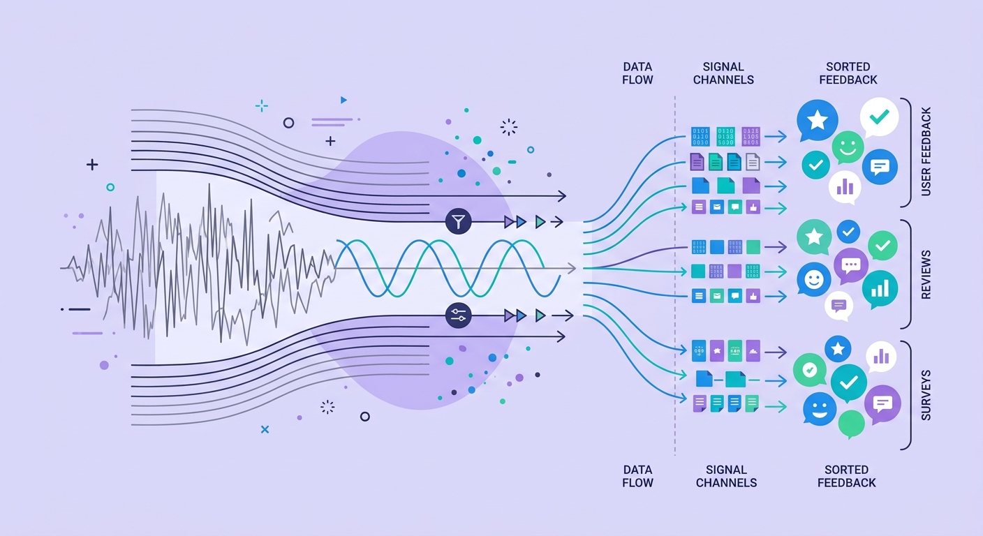
This is the prototype fidelity mismatch: the level of visual finish in what you show participants silently sets the altitude of the feedback you receive. High fidelity pulls the conversation down to the pixel. Low fidelity keeps it up at the concept. And most teams pick fidelity based on what is convenient to build or impressive to show stakeholders -- never realizing they are pre-selecting which layer of their design gets scrutinized.
Polish Reads as Commitment
Participants are not designers, but they are exquisitely sensitive to social signals about effort and permanence. A hand-drawn wireframe reads as "we're still figuring this out -- tell us anything." A pixel-perfect, animated, real-copy mockup reads as "a team of people spent weeks on this and shipping is close." No participant wants to be the person who tells a room full of professionals that the thing they clearly labored over is fundamentally wrong.
So they calibrate. Faced with apparent commitment, they downshift to feedback that feels safe and proportionate: cosmetic notes, small copy tweaks, praise for the parts that look finished. The structural critique -- the one you actually needed -- gets swallowed, not because they didn't have it, but because the artifact told them it was too late to raise it. This is a close relative of the reassurance reflex, where softening the hard question erases the very signal you were after; here the prototype itself does the softening before you say a word.
Three Ways Fidelity Distorts the Data
1. Attention capture. Realistic visuals recruit attention to visual properties. Real photos, real brand colors, and micro-interactions are cognitively louder than layout logic, so participants comment on what is salient rather than what matters. You get a rich transcript about aesthetics and a silent void where concept feedback should be.
2. Concept laundering. A weak idea wrapped in strong craft looks validated. When nobody objects to the flow, teams read the absence of criticism as endorsement -- when it was really just suppressed by polish. This is the same mechanism as the confidence calibration gap, where fluent, certain-sounding surfaces get trusted more than they deserve.
3. Vocabulary anchoring. Finished copy hands participants your words. Instead of describing the problem in their own terms, they parrot your labels back, and you lose the raw language that reveals mental models -- the same trap as the vocabulary mirroring effect that freezes users in your first framing.
Match Fidelity to the Question, Not the Calendar
The fix is not "always use low fidelity." It is deciding, before you build anything, which layer of the design you are testing this week -- and deliberately starving every other layer of finish so it cannot steal attention.
If you are testing the concept, the information architecture, or whether the flow matches how people actually think, use the roughest artifact that can still carry the idea: grayscale boxes, placeholder copy, no brand. Deprive participants of anything cosmetic to grab. If you are testing visual comprehension, hierarchy, or trust cues, then and only then does high fidelity earn its place -- because now the surface is the thing under test.
The governing principle is that finish is an instruction to the participant. Every rendered detail says "this is done, don't touch it." So render only what you want protected from feedback, and leave everything you actually want challenged looking obviously unfinished. This is fundamentally a research-design decision, and getting it wrong quietly corrupts the study before a single session runs -- the kind of upstream error that data pipelines fail to catch downstream because the contract between what was intended and what was measured was never made explicit.
Why This Gets Worse With AI-Generated Prototypes
The fidelity mismatch is intensifying because the cost of polish has collapsed. AI design tools now produce production-quality mockups in minutes, which means the default artifact a team brings to a session is increasingly high fidelity -- not because the concept is settled, but because polish became free. Teams are accidentally testing surface-level questions on ideas that were never conceptually validated.
Worse, when AI also generates the synthesis, the cosmetic feedback that dominates these sessions gets written up as if it were the whole story, smoothing over the missing structural critique. That is the same failure mode as confabulation in AI interview summaries, where fluent machine-written findings invent a coherence the data never had. The prototype suppresses the deep feedback, and the AI summary papers over its absence.
The Takeaway
Fidelity is a research variable, not a production milestone. Before your next study, ask which layer of the design you actually need challenged -- and then make sure everything else looks too unfinished to distract from it. The polish you are proud of may be the exact reason your participants never told you the concept was broken.
Ready to run studies where the artifact serves the question instead of steering it? See how Qualz.ai helps teams design and analyze research that surfaces structural feedback, not just surface notes.