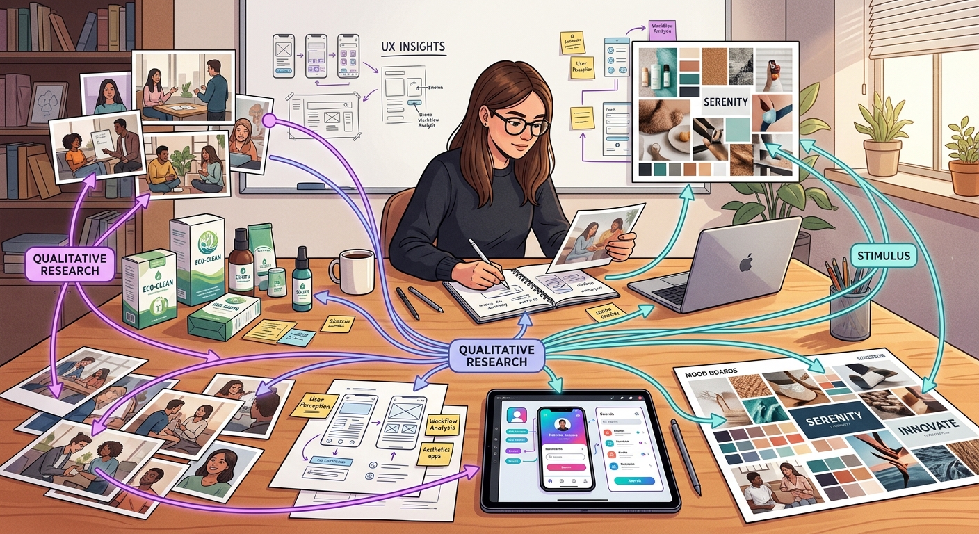
Why Stimulus Materials Matter in Qualitative Research
Ask someone what they think about a new product concept in the abstract, and you get abstract answers. Show them a prototype, an image, or a storyboard, and everything changes. The conversation gets specific. Reactions become visceral. Contradictions surface.
That is the power of stimulus-based qualitative research: grounding open-ended inquiry in concrete materials so participants respond to something real rather than something imagined.
Stimulus materials have been a staple of qualitative research for decades, from early photo elicitation studies in anthropology to the concept boards passed around modern focus groups. But the landscape has shifted dramatically. Researchers now work with video, interactive prototypes, audio clips, and AI-generated mood boards — and they deploy these stimuli not just in person but across asynchronous, remote, and AI-moderated interviews.
This guide covers every major type of stimulus material, explains the semiotic roles each can play, flags the pitfalls that trip up even experienced researchers, and shows how modern platforms handle stimulus presentation without the screen-sharing hacks of the Zoom era.
The Three Roles of Stimulus: Clue, Microcosm, Provoker
Before diving into specific types, it helps to understand what stimulus materials actually do in an interview. Drawing from semiotic theory, every piece of stimulus serves one (or more) of three roles:
1. Stimulus as Clue
The material stands in for something larger. A single packaging design represents the brand. A UI screenshot represents the entire product experience. Participants decode the clue and project meaning onto the wider concept.
When it works: Early-stage exploration, brand perception studies, logo and packaging research. You want participants to infer broader qualities from limited signals.
Risk: Participants may fixate on surface details of the clue (a color choice, a font) rather than engaging with the larger concept it represents.
2. Stimulus as Microcosm
The material is a self-contained world. A video ad tells a complete story. A clickable prototype simulates a real workflow. Participants react to the experience as a whole rather than projecting beyond it.
When it works: Concept testing, ad evaluation, UX research. You want reactions to the thing itself, not extrapolations from it.
Risk: High-fidelity microcosms can trigger the "finished product" assumption — participants hold back criticism because the material looks polished and therefore feels decided.
3. Stimulus as Provoker
The material is deliberately incomplete, ambiguous, or provocative. It exists to spark conversation, surface tensions, or reveal latent attitudes. Collages, abstract images, or rough sketches fall here.
When it works: Exploratory research, cultural probes, emotional territory mapping. You want participants to bring their own meaning to the material.
Risk: Too much ambiguity and participants feel confused rather than stimulated. The line between "thought-provoking" and "confusing" is thinner than most researchers expect.
Understanding these three roles is not academic — it directly shapes how you design and sequence stimulus in your interview guide. A mood board used as a provoker requires different facilitation than the same mood board used as a clue for brand positioning.
The Seven Types of Stimulus Material
1. Images and Photographs
The most common form of stimulus in qualitative research. Images range from product shots and packaging mockups to ad concepts, competitor shelf sets, UI screenshots, and cultural reference imagery.
Photo elicitation — showing participants photographs and asking them to narrate their reactions — has roots in visual anthropology dating to the 1950s. It remains one of the most reliable techniques for bypassing rationalised responses. People react to images faster and more emotionally than they respond to verbal descriptions.
Best for:
- Brand and packaging research (shelf impact, visual hierarchy)
- Ad concept testing (print, digital, OOH)
- UX evaluation (screenshot walkthroughs)
- Cultural and lifestyle exploration (reference imagery boards)
- Competitor benchmarking (showing competitive set)
Practical tips:
- Control image resolution and size carefully. A pixelated product shot triggers "this looks cheap" reactions that have nothing to do with the actual concept.
- When testing multiple images, randomize order across participants to mitigate order effects.
- For stimulus images in interviews, ensure the platform presents them at consistent quality across devices.
- Strip metadata and watermarks. Participants notice — and it changes how "real" the concept feels.
Semiotic role: Images most often function as clues (a single pack shot represents the brand) or provokers (abstract or cultural reference images trigger free association).
2. Video Clips
Video stimulus includes everything from finished TV ads and social content to rough animatics, user journey recordings, service encounter footage, and competitor reels. The addition of motion, sound, and time transforms how participants engage compared to static images.
Best for:
- Ad testing (TV, digital video, social)
- Service design research (recorded customer journeys)
- Competitor analysis (reel of competitor advertising)
- Behavioral observation (showing participants their own recorded behavior for reflection)
- Concept communication (animatics for pre-production concepts)
Practical tips:
- Keep clips short. Anything over 90 seconds in a research context risks losing participant attention and muddying recall. If the full ad is 60 seconds, show it at full length, but a 5-minute service recording should be edited to key moments.
- Always test playback on the participant's likely device. Buffering kills momentum in remote interviews.
- For animatics and rough cuts, brief participants: "This is an early version — we are interested in the idea, not the production quality."
- In asynchronous research, confirm that participants actually watched the full clip before proceeding to questions (modern platforms can track this).
Semiotic role: Video naturally functions as a microcosm — it creates a self-contained narrative world. Rough animatics lean toward clue territory, requiring participants to extrapolate from an unfinished representation.
3. Prototypes
Prototypes span a massive fidelity range: paper wireframes, Figma clickable mockups, coded functional prototypes, 3D-printed product samples, and physical packaging dummies. The fidelity level you choose is arguably the most consequential stimulus decision you will make.
Best for:
- UX and product design research (task flows, navigation, feature validation)
- Physical product testing (form factor, ergonomics, shelf presence)
- Service concept testing (simulated booking flows, checkout experiences)
- Pricing research (presenting options in a realistic purchase context)
Practical tips:
- Match fidelity to research stage. Paper wireframes for concept exploration. Clickable mockups for usability. Coded prototypes for validation. Getting this wrong is the stimulus fidelity trap (more on this below).
- For remote research, clickable prototypes (Figma, InVision, or coded) work far better than screen-shared static wireframes. Participants need to interact, not just observe.
- If showing a physical product in remote research, multi-angle video walkthroughs outperform still photos.
- Label prototypes honestly. "We built this quickly to get your reaction" sets the right frame. Unmarked high-fidelity prototypes get treated as finished products.
Semiotic role: Low-fidelity prototypes work as clues (participants project the full experience from partial signals). High-fidelity prototypes function as microcosms (the experience is self-contained and testable as-is).
4. Text Vignettes
A text vignette is a short written scenario, concept description, or positioning statement presented to participants for reaction. Vignettes are underrated — they are fast to produce, easy to iterate, and they isolate the idea from execution quality.
Best for:
- Concept screening (testing the idea before investing in visuals)
- Positioning research (which value proposition resonates)
- Claims testing (functional, emotional, and social claims)
- Scenario-based research (placing the participant in a hypothetical situation)
- Segmentation studies (different framings for different audiences)
Practical tips:
- Keep vignettes between 50 and 150 words. Longer than that and you are writing a brief, not a stimulus.
- Write at participant reading level, not brand-team vocabulary level. Jargon kills concept testing.
- Test multiple vignettes? Rotate order. Text stimuli are especially vulnerable to order effects because participants anchor on the first framing.
- For structured vs unstructured interviews, vignettes work in both but shine in semi-structured designs where you want consistent stimulus across participants while leaving room for open-ended probing.
Semiotic role: Vignettes are almost always clues — participants read a description and project the full product or experience from it. Deliberately provocative or contradictory vignettes can serve as provokers.
5. Audio
Audio stimulus includes brand jingles, radio ads, podcast ad reads, voice UI samples (Alexa skills, IVR menus), sonic logos, and background music or ambient soundscapes. Audio is the most neglected stimulus type in commercial qualitative research, yet sound triggers emotion faster than any visual.
Best for:
- Sonic branding research (jingles, sonic logos, hold music)
- Voice UI and conversational AI testing
- Radio and podcast advertising evaluation
- Retail environment design (in-store music, ambient sound)
- Multi-sensory brand experience research
Practical tips:
- Audio demands better participant hardware than images. Cheap laptop speakers distort bass and flatten dynamics. In recruitment screeners, ask about listening setup.
- Play audio before showing any visual. Once participants see an image, it anchors their audio reaction.
- For voice UI testing, simulate the back-and-forth. Play a prompt, let the participant respond verbally, then play the next system response. Static playback of a full dialogue misses the interaction entirely.
- In async research, confirm headphone use or at minimum note the listening environment.
Semiotic role: Audio functions powerfully as a provoker — it triggers emotional and associative responses that participants often struggle to articulate verbally, which is exactly why it generates rich qualitative data. Finished audio pieces (complete ads, jingles) serve as microcosms.
6. Mood Boards and Collages
Mood boards assemble multiple visual (and sometimes textual) elements into a single composition that conveys an aesthetic direction, brand territory, or emotional tone. Collages follow a similar logic but are sometimes created by participants themselves as a projective exercise.
Best for:
- Brand identity development (visual territory exploration)
- Aesthetic direction research (packaging, retail design, digital design)
- Target audience profiling (lifestyle and aspiration mapping)
- Creative brief development (aligning agency and client on tone)
- Projective techniques (participant-created collages for self-expression)
Practical tips:
- Curate ruthlessly. A mood board with 30 images is not a mood board — it is a Pinterest dump. Five to eight images that cohere around a single territory is the goal.
- Remove or obscure any recognizable brand logos unless brand association is the point. Participants will anchor on known brands.
- When comparing multiple mood boards (e.g., three brand territories), ensure similar image density and quality across boards. An unintentionally "prettier" board will win on aesthetics, not concept.
- Digital mood boards in remote research should be viewable as a single composition, not a scrollable gallery. The gestalt matters.
Semiotic role: Mood boards are the quintessential provoker. They invite projection, free association, and emotional labeling. When tightly curated around a single concept, they can also function as clues for a brand direction.
7. Storyboards
Storyboards use sequential panels — illustrated, photographic, or diagrammatic — to depict a journey, process, or narrative over time. They include classic comic-style storyboards for ad concepts, customer journey maps presented as visual narratives, and service blueprints translated into participant-friendly formats.
Best for:
- Ad concept testing (pre-production storyboards for TV, video)
- Customer journey research (mapping and validating touchpoint sequences)
- Service design (depicting a new service from the customer's perspective)
- Onboarding flow evaluation (step-by-step visual walkthrough)
- Future-state envisioning (showing a proposed experience that does not yet exist)
Practical tips:
- Number each panel and reference panels by number in discussion. "Looking at panel 3, where you receive the notification..." anchors the conversation.
- Illustration style matters more than you think. Stick figures signal "early idea — give honest feedback." Polished illustrations signal "this is decided." Choose deliberately.
- For journey-based storyboards, include emotional indicators (facial expressions, thought bubbles) to prompt emotional rather than purely functional responses.
- In remote settings, present storyboards panel-by-panel with pauses for reaction rather than showing the full sequence at once. Sequential reveal mirrors the temporal nature of the experience.
Semiotic role: Storyboards function as microcosms when they depict a complete narrative arc, and as clues when they show fragments of a larger journey that participants must mentally complete.
Common Pitfalls in Stimulus-Based Research
Even experienced researchers fall into recurring traps when working with stimulus. Here are the ones that cost the most in data quality:
The Stimulus Fidelity Trap
This is the single most common error in stimulus-based research. It occurs when the fidelity of the stimulus does not match the research objective.
Too high: A pixel-perfect UI prototype shown during exploratory concept research. Participants critique button placement and color choices instead of engaging with the underlying value proposition. The polish signals "this is finished" and suppresses honest conceptual feedback.
Too low: A rough text description used for usability research. Participants cannot meaningfully evaluate interaction flows from a paragraph. They need something to interact with.
The fix is simple in theory but requires discipline: explicitly define your research objective first, then select the minimum viable fidelity that enables participants to engage with that objective.
Order Effects
When participants see multiple stimuli, their reaction to each one is shaped by what came before. The first concept sets the reference frame. Subsequent concepts are evaluated relative to it rather than independently.
Mitigation strategies:
- Randomize stimulus order across participants (table-stakes for any multi-stimulus design)
- Use a "reset" question between stimuli ("Before we look at the next one, let us return to your overall needs...")
- In monadic designs, each participant sees only one stimulus (highest data quality, highest cost)
- In sequential monadic designs, each participant sees all stimuli but in a randomized order with independent evaluation before any comparison
Leading with Polished Designs
Showing polished, near-final creative work in qualitative research is a political act disguised as a methodological one. It often means the design team wants validation, not exploration. When participants see polished work, social desirability bias kicks in — they compliment rather than critique because the effort invested is visually apparent.
The antidote: If you must test polished work, explicitly permission criticism. "The team that created this wants to know what is not working. Your honest reaction helps them improve it." Frame honesty as helpful, not hostile.
Stimulus Overload
Showing too many stimuli in a single session fragments attention and produces shallow reactions. Six concept boards in a 30-minute interview means roughly five minutes per concept after warm-up and wrap-up. That is not enough for depth.
Rule of thumb: No more than three to four distinct stimulus pieces in a 45-minute interview if you want genuine depth on each. If you need to screen more options, use a quantitative pre-screen and bring the top candidates into qualitative.
Ignoring Device and Context Effects
A packaging mockup looks different on a 27-inch monitor than on a phone screen. A video ad shot in 4K loses impact when compressed and played through laptop speakers. In remote research, you do not control the participant's environment — so you need to account for it.
Practical steps: Include a device and environment check at the start of the session. "What device are you using? Are you in a quiet space?" is not wasted time — it contextualizes every stimulus reaction that follows.
How AI-Moderated Platforms Handle Stimulus Natively
The shift to remote qualitative research during and after 2020 created an awkward stimulus problem. Researchers conducting live video interviews would share their screen to show images, fumble with video playback, or email prototypes with instructions like "open this Figma link and share your screen back." The experience was fragile, inconsistent, and ate into precious interview time.
AI-moderated interview platforms solve this structurally. When stimulus is a first-class feature of the platform — not a bolt-on workaround — several things change:
Consistent presentation. Every participant sees images at the same resolution, videos play with the same quality, and prototypes render identically. No more "can you see my screen?" troubleshooting.
Embedded in the conversation flow. Stimulus appears at the right moment in the interview — after warm-up questions, before probing — as designed in the interview guide. There is no moderator context-switching between a question script and a stimulus folder.
Automatic order randomization. Modern platforms randomize stimulus order per participant automatically, eliminating the manual tracking spreadsheets researchers used to maintain.
Engagement tracking. Platforms can measure how long a participant viewed an image, whether they watched a full video, or how they interacted with a prototype — providing behavioral data alongside the verbal response.
Scale without compromise. A human moderator can run perhaps six to eight in-depth interviews per day before fatigue degrades quality. An AI-moderated platform runs hundreds of interviews simultaneously, each with stimulus images presented identically and probing adapted to the participant's actual responses.
This is not about replacing human judgment in research design. The researcher still decides which stimuli to use, in what order, with what probing logic. But the execution — showing the right thing at the right time to the right participant — is handled by the platform with a consistency no human moderator can match across hundreds of sessions.
Choosing the Right Stimulus Type: A Decision Framework
When selecting stimulus materials, work through these four questions in order:
1. What is the research question?
Exploration and discovery favor low-fidelity, open-ended stimuli (mood boards, rough sketches, cultural reference images). Evaluation and validation favor higher-fidelity, complete stimuli (prototypes, finished ads, polished concepts).
2. What stage is the concept?
Match stimulus fidelity to concept maturity. Early-stage concepts get text vignettes and mood boards. Mid-stage concepts get wireframes and animatics. Late-stage concepts get clickable prototypes and finished creative.
3. What response type do you need?
Emotional, gut-level reactions favor images, audio, and mood boards. Behavioral and usability insights favor interactive prototypes. Cognitive evaluation of propositions favors text vignettes and storyboards.
4. What is the research format?
In-person research can leverage physical samples and environmental setups. Remote synchronous research needs digital stimuli with reliable playback. Asynchronous and AI-moderated interviews need stimuli that are self-explanatory without live moderator context-setting.
Stimulus Combinations: Layering for Depth
The most insightful research often uses multiple stimulus types in a single study, layered deliberately:
Open to focused. Start with a mood board (provoker) to surface unaided associations. Move to concept vignettes (clues) to introduce specific ideas. Finish with a prototype (microcosm) for detailed reaction. Each layer builds on the previous one while shifting from open exploration to focused evaluation.
Abstract to concrete. Begin with audio or abstract imagery to explore emotional territory. Then introduce specific product visuals or text descriptions. This sequence prevents premature anchoring on execution details.
Participant-generated then researcher-provided. Ask participants to bring or create their own images, collages, or descriptions first. Then introduce your stimulus. Comparing participant-generated and researcher-provided materials reveals gaps between the consumer's world and the brand's assumptions.
Building Your Stimulus Strategy
Stimulus-based qualitative research is not about showing things to people and asking "what do you think?" It is a deliberate methodological choice with real consequences for data quality. The type of stimulus you choose, the fidelity level, the sequence, the presentation format — every decision shapes what participants can tell you.
The most common mistake is treating stimulus as an afterthought: the research design is set, the discussion guide is written, and then someone asks "oh, what should we show them?" Stimulus selection should happen during research design, not after it. It should be driven by the research question, matched to the concept stage, and adapted to the research format.
The shift to remote and AI-moderated research has made this both easier and more important. Easier because platforms now handle stimulus natively — no more duct-taping screen shares and email attachments into a coherent participant experience. More important because without a live moderator to improvise when a stimulus falls flat, the upfront design work has to be better.
If you are running qualitative research with stimulus materials and want to see how an AI-moderated platform handles them natively — consistent presentation, automatic randomization, engagement tracking, and scale — [book a demo with Qualz.ai](https://app.reclaim.ai/m/qualz-info-session/qualz-information-session) and bring your own stimulus materials. We will show you exactly how they work in a live interview flow.