The Dynamic Survey ‘Analysis‘ feature makes it super easy to see how your survey is doing. Get the full picture with insights on responses, participant data, question performance, and overall survey trends. Plus, you can customize your reports to dig even deeper into the results! All your key info in one place—simple, quick, and ready to help you make the best decisions!
Survey Insights Overview #
Once you’ve sent out your survey, it’s time to track and analyze the responses. Simply monitor your for updates as the responses start rolling in.
You can access your survey insights in two ways:
- Click on the notification you receive when responses start coming in.
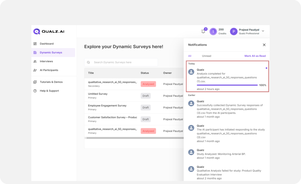
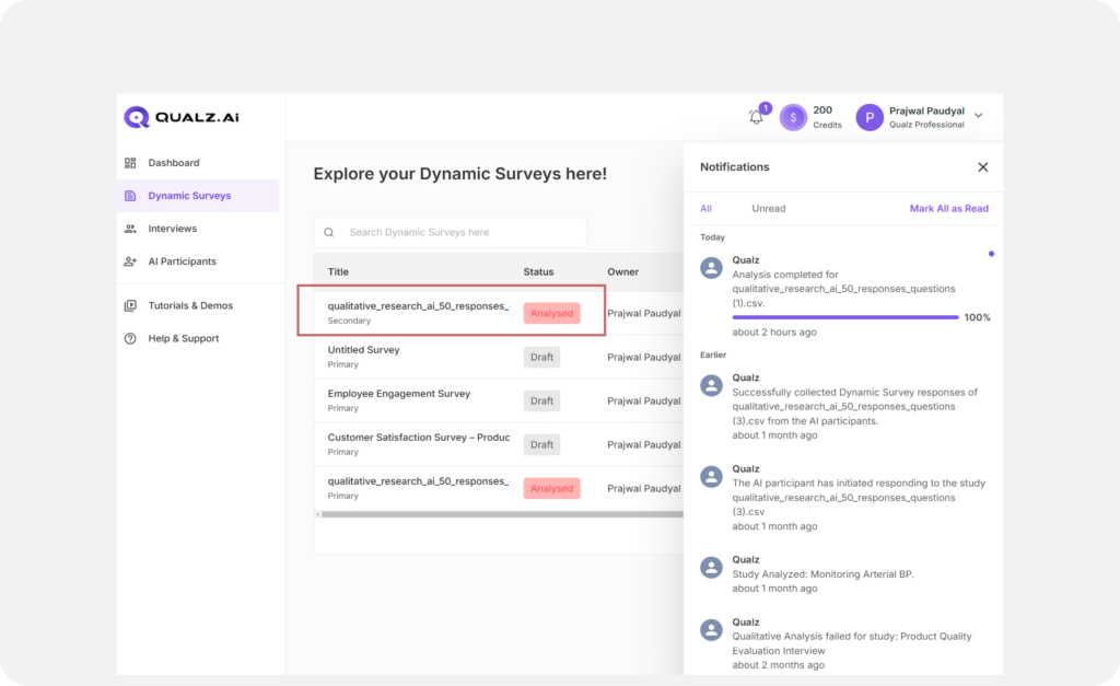
- Click on your survey in the survey list on your Dynamic Surveys.
Both will lead you directly to the Survey Analysis Dashboard, where you’ll find all the tools and insights you need.
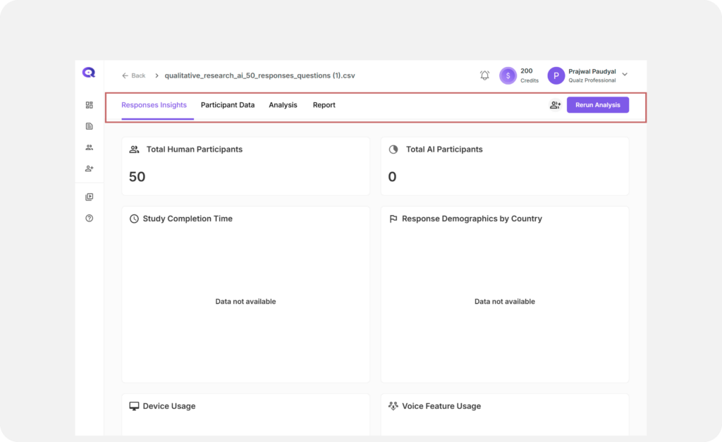
What’s Inside the Survey Analysis Dashboard? #
Here, you can dive into the most important insights and data for your survey. The key sections are:
- Responses Insights
- Participant Data
- Analysis
- Report
Pro Tip: #
After reviewing your insights, you can always Rerun Analysis if you’d like to dig deeper. Don’t worry—this can be done anytime you need to get more detailed results, but for now, let’s stick with an overview of the key sections.
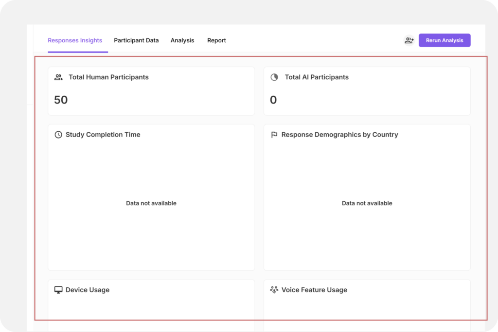
Responses Insights #
In the Responses Insights tab, you’ll get an overview of how your survey is performing. You’ll see:
- Total Human Participants: How many real people have responded to your survey.
- Total AI Participants: Responses collected from AI-generated participants.
- Study Completion Time: The average time it took participants to complete your survey.
- Responses Demographics by Country: A breakdown of where your respondents are located, giving you a global perspective on your data.
- Device Usage: See what devices (mobile, desktop, tablet) were used to take your survey.
- Voice Feature Usage: If you used voice-based features, you’ll see how many participants interacted with them.
These insights are all displayed in easy-to-read graphs, so you can quickly understand trends and patterns in your data. It’s all about making the data clear and actionable!
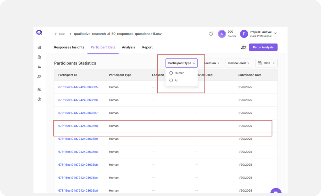
Participant Data #
The Participant Data feature gives you a closer look at who’s responding to your survey. It helps you identify trends, ensure your sample is representative, and dive deeper into participant demographics and response patterns.
Viewing Participant Details #
Click on Participant Data to open the table with all the details. Here’s what you’ll find:
- Participant ID: A unique identifier for each individual participant.
- Participant Type: Whether the response came from an AI or a human participant.
- Location: See where your participants are located around the world.
- Device: Find out which device your participants used to take the survey (desktop, mobile, tablet).
- Voice Feature Usage: Whether the participant interacted with the voice feature (Yes or No).
- Submission Date: The start and end dates when responses were submitted.
Filter to view Participant Data #
Use the handy filters to narrow down your data by participant type, location, device, or date range—making it easy to get the specific insights you need.
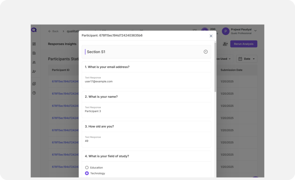
Accessing Individual Responses #
Click on a Participant ID to view their detailed response data, including answers to all survey questions on a single page.
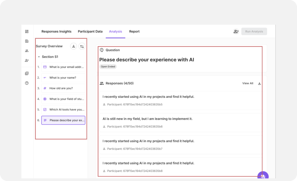
Analysis #
Analyze responses to individual questions for deeper insights, such as identifying key themes, highlighting participant sentiment, or pinpointing areas for improvement in your survey.
Navigating the Analysis Tab #
- View the Survey Title, Sections, and Questions on the left panel.
- Click a specific question to see its details on the right:
- on the right-hand side you will see the Question and Question Type
- by default you will see 4 questions on the screen, if you want to see all, click view all
Qualitative Analysis #
The Qualitative Analysis tab is where the magic happens! Dive deeper into your survey questions and uncover detailed insights through intuitive visualizations and easy-to-understand analysis tools.
What You’ll See in Qualitative Analysis #
- Responses:
Participants’ answers are color-coded to highlight key themes. This makes it easy to spot trends and patterns at a glance.
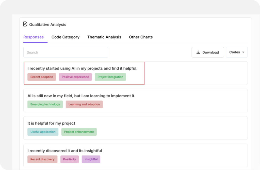
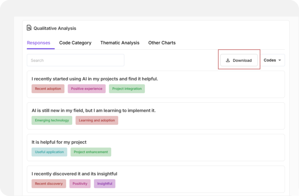
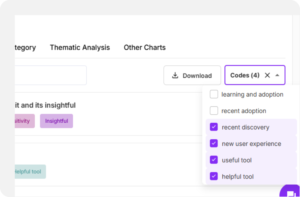
You can view the responses using Code Filter, analyze the data with ease. You can also download the responses to analyze it offline, share insights or to create a custom report..
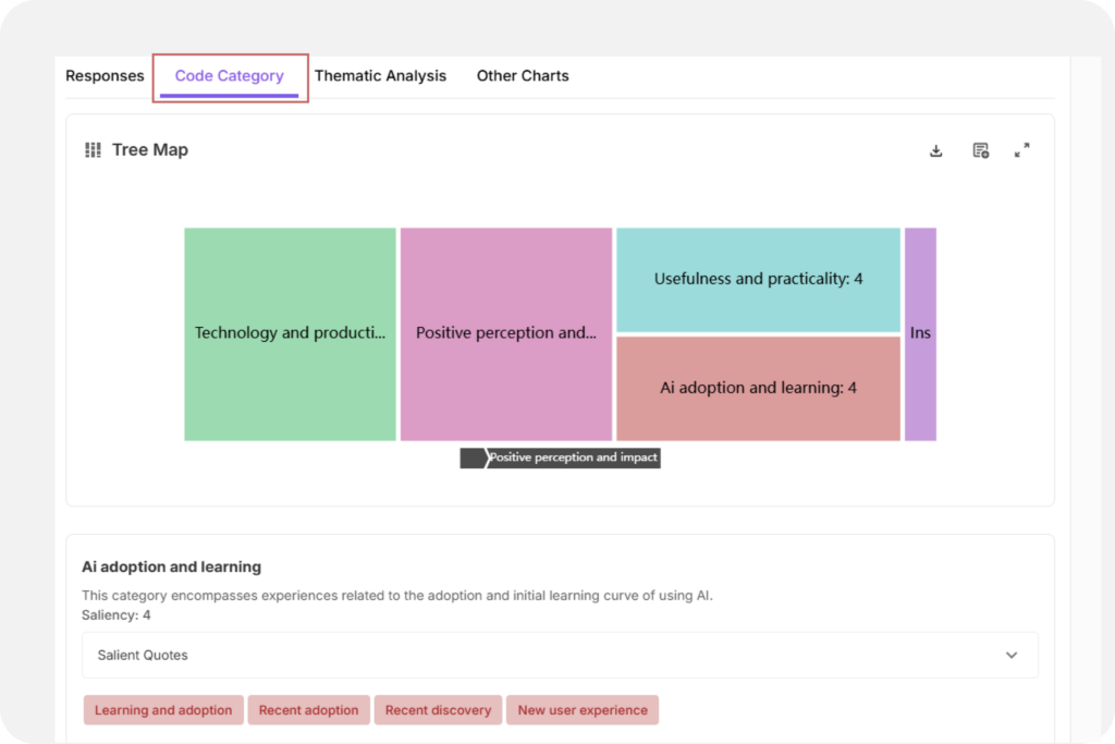
- Code Category:
Discover a Tree Map that organizes topics and related codes visually. It’s like having a bird’s-eye view of the main ideas in your data.
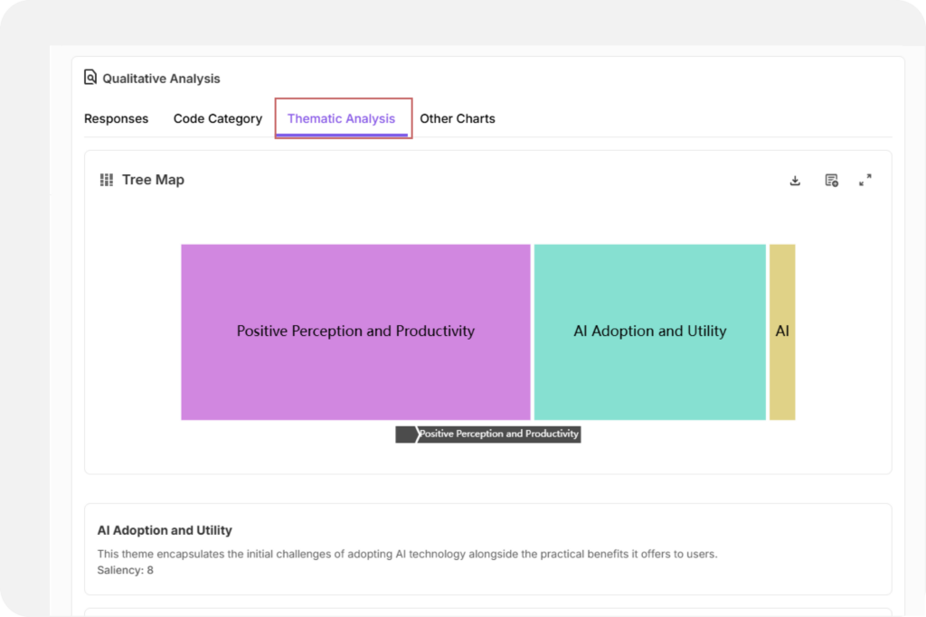
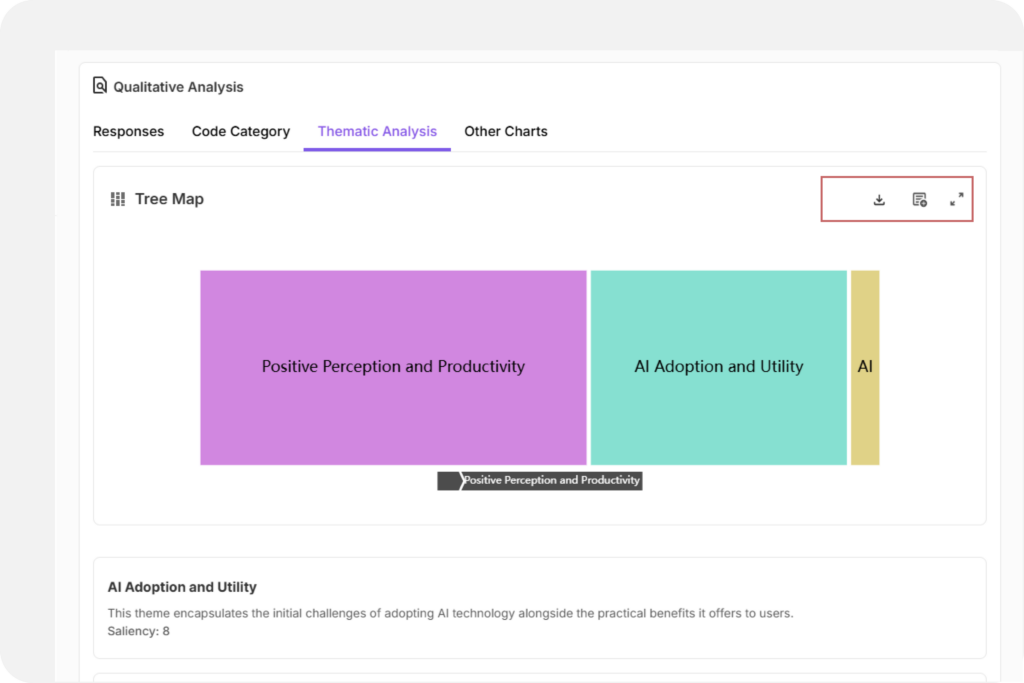
- Thematic Analysis:
Go even deeper with interactive Tree Maps that break down your data into themes, categories, and codes. These tools help you understand the “why” behind the answers. Plus, you can export these visualizations for presentations or reports.
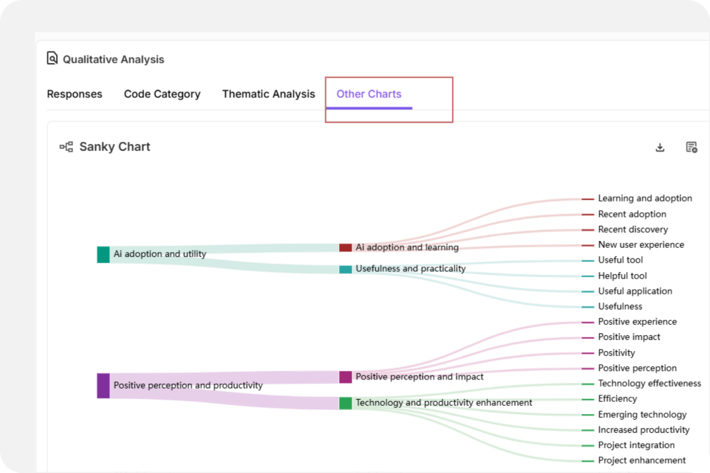
- Other Charts
Sankey Chart: Displays the hierarchical flow of themes, categories, and codes. Path width reflects saliency.
Note:
1. You can download charts like Code Category, Thematic Analysis, and Other Charts in PNG files
2. Add them to Report Section for easy access
3. View and download anytime from the Reports tab
Discover how the icons highlighted in the top-right corner of the image can elevate your offline reports. You can download ideas for offline use and explore our Report Tab to create a more detailed report. Are you curious about report section? Click here to explore!


