The Open-Text Collapse
You run a 4,000-response survey. Three open-text questions. You paste the export into an AI analysis tool, and ninety seconds later you have eight themes with percentages next to them: "Pricing concerns 31%", "Onboarding friction 22%", "Integration gaps 18%". The chart looks like quantitative data. It gets pasted into a board deck. Someone builds a roadmap on it.
Here is what actually happened. The model read 4,000 responses, most of which were between four and eleven words long, and assigned each one to the nearest available bucket. The responses that did not fit anywhere got assigned anyway, because the pipeline had no null category. The responses that fit two buckets got assigned to one. The 340 responses that said something genuinely new -- a use case nobody on the team had considered -- got absorbed into "Other feedback" or, worse, distributed across the eight themes as noise.
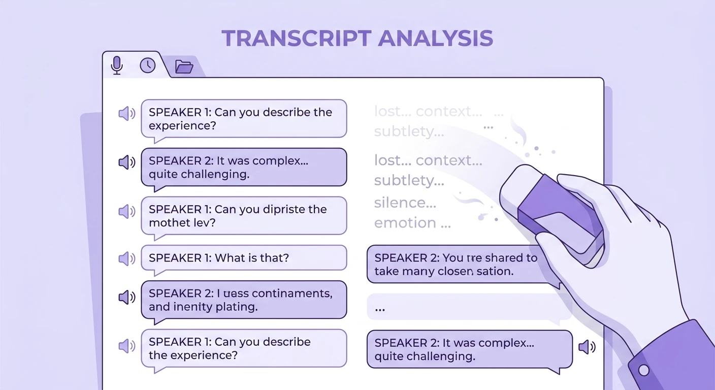
That is the Open-Text Collapse: the systematic loss of variance that occurs when automated coding is optimised for a clean, presentable output rather than for faithful representation of what respondents wrote. The output is not merely incomplete. It is confidently wrong in a specific direction -- toward the themes the analyst already expected, because those were the categories seeded into the prompt.
Survey open-text is the highest-volume qualitative data most teams own, and the least rigorously analysed. Automating it well is genuinely one of the biggest wins available in research operations. Automating it badly produces the most dangerous artifact in the business: a qualitative finding wearing a quantitative costume.
Why the collapse happens
Four mechanisms, and they compound.
Category seeding. Almost every AI survey analysis workflow starts with a prompt that says something like "identify the main themes in these responses." That sounds open. It is not. The model has a strong prior toward producing five to nine themes, because that is what "main themes" looks like in its training data. If you hand it 4,000 responses containing forty distinct concerns of varying prevalence, it will still hand back seven. The number of themes is set by the format expectation, not by the data. Anyone who has run an open card sort recognises this pattern -- it is structurally identical to the contamination that pre-labeled categories introduce into open card sorts, except the labels are supplied by the model instead of the moderator.
Length-weighted salience. Open-text responses have wildly uneven length. A respondent who writes 200 words about a billing failure produces far more tokens, more distinctive vocabulary and more semantic surface area than the 600 respondents who typed "too expensive". In a naive embedding-and-cluster pipeline, the long response anchors a cluster; the short ones scatter. You end up with a theme built around one articulate person and a residual bin containing the actual majority signal. This is the survey-scale version of the verbatim overweighting effect, where one quotable sentence hijacks an entire readout.
Forced assignment. Classification pipelines without an explicit "does not fit" outcome will always assign. Softmax has no abstain button unless you build one. So the 8% of responses that are jokes, non-answers, "n/a", "see above", or genuinely novel content get distributed into your themes and inflate every percentage. The percentages are the part stakeholders remember.
Chunking and ordering artifacts. If you batch responses -- and at 4,000 rows you must -- the themes discovered in batch one become the implicit schema for batch two. The model has already committed. Later batches get squeezed into earlier categories. This is a direct analogue of a well-documented engineering problem: as the analysis of how the ordering of retrieved chunks silently changes an agent's answers shows, position in the context window is not neutral. Feed the same 4,000 responses in reverse order and you will get a different codebook. Most teams never test this.
What the collapse costs
The failure is not that you get the wrong themes. Often the top three themes are roughly right -- they are the loud, obvious ones you could have guessed. The failure is in the tail, and the tail is where survey open-text earns its keep.
A subscription software company ran a 6,000-response churn survey. Automated analysis returned "price" as the leading reason at 34%. The pricing team spent a quarter modelling discounts. When the same data was re-coded with a pipeline that allowed sub-themes and an explicit unassignable bucket, "price" fractured into four distinct things: genuine budget constraints, price relative to a competitor, price relative to usage (people paying for seats they did not fill), and price as a socially acceptable stand-in for "I never got value out of it". Only the second was addressable by discounting. The third was an account-management problem with a much cheaper fix. The fourth was an onboarding problem that had been invisible for two quarters because it hid inside the biggest bar on the chart.
That is the shape of the damage: a collapsed theme is not just imprecise, it is actively misdirecting, because it names an intervention that does not match the underlying cause. The segment averaging illusion, where blending personas in analysis erases the user you are designing for, operates on the same logic -- the average of two real things is often a third thing that does not exist.
There is a second cost. Once a percentage exists, it acquires authority no qualitative finding should have. "31% cited pricing" travels through the organisation stripped of its methodology. Nobody downstream knows the denominator excluded non-responses, or that the coder was a language model with no abstain option, or that a 4% shift between two themes falls well inside the pipeline's own reliability band.
What good automation actually looks like
Automating survey analysis is right. Manual coding of 4,000 open-text responses is a two-week job that produces its own drift, its own coder disagreement and its own fatigue effects. The problem is not the automation. It is automation designed to produce a deck instead of a defensible codebook.
Separate discovery from classification. These are two different jobs and they need two passes. Pass one: sample -- randomly, not by length -- 300 to 500 responses and derive an open codebook from them with no seed categories. Review it as a human. Merge, split, rename. Pass two: classify all 4,000 responses against that fixed, reviewed codebook. Now your categories are stable and your percentages mean something, because the schema did not shift mid-run. If you want the mechanics of the first pass done properly, our walkthrough of generating qualitative codebooks automatically covers the review step that most teams skip.
Build an explicit unassignable category and watch its rate. Every classification run should report the percentage of responses that fit nothing. If that number is under 2%, your model is force-fitting. If it is over 15%, your codebook is incomplete and needs another discovery pass. Somewhere between 3% and 10% is where an honest pipeline usually lands. This single metric catches more collapse than any other check.
Allow multi-label assignment. Real survey responses contain two or three concerns in one sentence. "Too expensive for what you get and support never replied" is a pricing response and a support response. Single-label pipelines choose one and silently discard the other. Report both counts and note that percentages will exceed 100. Stakeholders can handle it; they cannot handle a phantom precision.
Run an order-inversion test. Take your 4,000 responses, shuffle, re-run classification, compare theme distributions. If any theme moves more than a few points, your pipeline is order-sensitive and your percentages have a wider error band than you are reporting. Publish that band. This is the qualitative equivalent of the discipline described in observability-driven development for AI agents: instrument the system so its variance is visible, rather than discovering it after a decision goes wrong.
Preserve the link from theme to verbatim. Every theme in the output must carry the response IDs that produced it, and any stakeholder should be able to click through and read them. Aggregate-only outputs cannot be audited, and unauditable outputs are where confident nonsense lives. Our evidence density test for what a real qualitative report looks like sets a useful bar here.
Segment before you aggregate, not after. Run classification within segments -- plan tier, tenure, region, role -- and compare codebooks. Themes that are 8% overall and 40% in one segment are the finding. Global percentages hide them by construction.
Follow up the ambiguous responses. The single largest gain available in survey analysis is not better coding of the text you have. It is going back to the respondents whose answers were short, contradictory or unclassifiable and asking one adaptive follow-up. Static surveys cannot do this. Conversational and AI-moderated formats can, which is the argument behind dynamic surveys over static ones for richer insights. A four-word answer probed into a forty-word answer is worth more than any improvement to the classifier.
The reporting standard
When you present automated survey analysis, three numbers should appear on the same slide as your theme chart: total responses coded, unassignable rate, and the stability band from your shuffle test. If those three are absent, the audience has no way to distinguish a rigorous run from a nine-second one, and they will assume rigour because the chart looks like a chart.
Add one more line: the date of the codebook review and who did it. Codebooks rot. A schema derived from Q1 responses applied to Q3 responses will quietly misclassify anything the product changed in between -- the same decay problem covered in why research findings expire faster than teams assume.
Practical takeaways
- Split discovery from classification. Derive the codebook from a random sample with no seeded themes, review it by hand, then classify the full set against the frozen schema. Never let the codebook evolve mid-run.
- Instrument the unassignable rate. Report it on every run. Under 2% means force-fitting; over 15% means your codebook is incomplete. Treat this as your primary quality signal.
- Use multi-label coding and say so. Report that percentages sum above 100 rather than discarding the second concern in every compound response.
- Run the shuffle test before you present. Re-run classification on reordered data. Publish the resulting stability band alongside every percentage.
- Sample randomly, not by richness. Long responses are not more representative, only more legible. Weight your discovery sample by row, never by word count.
- Segment before aggregating. Run codebooks within key segments and compare. A theme that is small overall and dominant in one segment is your actual finding.
- Probe the short answers. Route ambiguous or four-word responses into an adaptive follow-up rather than trying to classify them harder. New data beats better inference on thin data every time.
Automated survey analysis is one of the few places in research where speed and rigour genuinely point the same direction -- but only if the pipeline is built to expose its own uncertainty rather than hide it behind a clean chart. If you want to see how a discovery-then-classification workflow with audit trails runs on your own open-text data, book a session with the Qualz.ai team and bring a messy export.