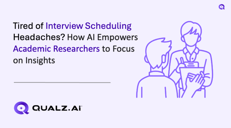
Visual research is the backbone of modern UX practice. Every time you show a participant a mockup, a screenshot, or a side-by-side comparison, you are running a visual research technique — whether you call it that or not.
The problem is that most UX researchers default to the same tired approach: share your screen on Zoom, fumble with tab switching, and hope participants can squint at a low-resolution feed long enough to give meaningful feedback. It works, but barely. And it certainly does not scale.
This guide breaks down five visual research techniques that every UX researcher should have in their toolkit, explains when and how to use each one, and shows how stimulus images in interviews through AI-moderated research make these techniques faster, sharper, and dramatically more scalable.
If you are still choosing between research methods, our comparison of surveys vs interviews vs usability testing is a useful starting point. But if you already know you need qualitative depth with visual stimulus, read on.
Why Visual Stimulus Changes Everything in UX Research
Humans process visual information roughly 60,000 times faster than text. When you ask someone "What do you think about our checkout flow?" you get vague, rationalized answers. When you show them the actual checkout screen and ask the same question, you get specific, grounded feedback tied to real interface elements.
Visual stimulus does three things that verbal-only interviews cannot:
It anchors the conversation. Participants respond to what they see, not what they imagine. This eliminates the gap between what they think they remember and what actually exists.
It surfaces subconscious reactions. First impressions, confusion points, and aesthetic judgments happen in milliseconds. You can only capture them if the stimulus is right there, visible, at the moment you ask.
It enables comparison. Showing two options side by side produces richer data than asking people to recall and compare from memory. This is foundational to techniques like competitive analysis and design system evaluation.
For a deeper dive into the methodology behind visual stimulus in qualitative research, see our stimulus-based qualitative research guide.
Now, let us get into the five techniques.
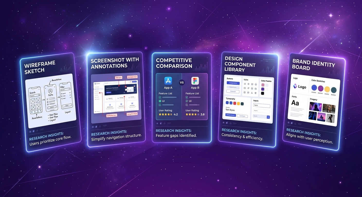
1. Screenshot Walkthroughs
Screenshot walkthroughs are the simplest and most versatile visual research technique. You capture screenshots of an existing UI — your own product, a competitor, or a prototype — and walk participants through them one at a time, collecting feedback on each screen.
When to Use It
- Evaluating an existing product before a redesign
- Identifying usability pain points in a live interface
- Gathering first impressions from new or prospective users
- Benchmarking how users perceive your current experience
- Post-launch validation to confirm whether a release solved the problems it aimed to fix
What Stimulus to Prepare
Capture clean, full-resolution screenshots of each screen or state you want to evaluate. Avoid annotating them with arrows or highlights — you want raw reactions, not guided ones.
Prepare 5-8 screenshots per session. More than that and participant fatigue sets in. Sequence them in the order a user would naturally encounter them (onboarding flow, task completion flow, etc.).
How to Structure the Interview
Start with an open-ended first impression question before diving into specifics:
Sample questions:
- "What is the first thing you notice on this screen?"
- "What do you think you are supposed to do here?"
- "Does anything confuse you or feel unclear?"
- "On a scale of 1-5, how confident would you feel completing the next step?"
- "What would you change about this screen if you could change one thing?"
Move from general to specific. Let participants react naturally before probing on particular elements.
Fidelity Level
High fidelity works best here. You want production-quality screenshots because you are evaluating an existing or near-final interface. Low-fidelity images trigger "it is just a rough draft" disclaimers that water down feedback.
Common Mistakes
Showing too many screens. Eight is the ceiling. Beyond that, responses get shallow and repetitive.
Leading with your hypothesis. Do not say "We think the navigation is confusing — what do you think?" Just show the screen and ask open questions.
Using tiny images. If participants have to zoom or squint, you are losing data. This is where AI-moderated interviews with embedded stimulus images shine — each image is presented at full resolution directly in the interview flow, not compressed through a screen-share codec.
2. Wireframe and Prototype Critique Sessions
Wireframe and prototype critique sessions show participants designs at varying levels of fidelity to gather feedback on layout, flow, hierarchy, and interaction patterns before committing to full development.
When to Use It
- Early-stage concept validation before investing in visual design
- Information architecture testing to validate layout and content hierarchy
- Interaction flow validation to confirm that task flows make sense
- Design iteration between rounds of refinement
- Stakeholder alignment to ground internal debates in user data
What Stimulus to Prepare
The fidelity level you choose is a strategic decision, not a default:
Low-fidelity wireframes (grayscale, no branding): Use these when you want feedback on structure, layout, and information hierarchy without aesthetic opinions clouding the data. Participants focus on "does this make sense?" rather than "do I like this color?"
Mid-fidelity prototypes (basic styling, placeholder content): Use these when you need feedback on flow and interaction patterns. Clickable prototypes in Figma or similar tools work well, but static screens are often sufficient for interview-based research.
High-fidelity prototypes (near-production visuals): Use these when you need feedback on the complete experience — visual design, micro-interactions, and emotional response included. Be aware that high-fidelity stimuli tend to generate more "polish" feedback and less structural feedback.
How to Structure the Interview
Frame the fidelity level explicitly so participants calibrate their feedback:
For low-fi: "This is an early concept — it is intentionally rough. I am interested in whether the layout and flow make sense, not how it looks."
For high-fi: "This is close to what we would build. I want your honest reaction to the overall experience."
Sample questions:
- "Walk me through what you think this page is for."
- "If you needed to [complete task X], where would you start?"
- "What information do you expect to find here that is missing?"
- "How does this compare to how you currently do this task?"
- "What feels right about this layout? What feels off?"
Fidelity Level
Match fidelity to your research question. If you are testing structure, go low. If you are testing emotional response, go high. Mixing fidelity levels within a single session is risky — participants struggle to shift their evaluation lens mid-conversation.
Common Mistakes
Using high-fidelity when you need structural feedback. Participants will fixate on button colors instead of telling you the navigation model is broken.
Not explaining the fidelity level. If you show a wireframe without context, some participants will apologize for criticizing "unfinished work" instead of giving honest feedback.
Skipping the task framing. Always give participants a task or scenario before showing the prototype. "Imagine you need to update your billing information" gives them a lens to evaluate through.
3. Competitive UI Comparisons
Competitive UI comparisons present your product alongside competitor interfaces — side by side — to understand how users perceive relative strengths, weaknesses, and differentiators.
When to Use It
- Pre-design research to understand the competitive landscape through user eyes
- Positioning validation to test whether your differentiation actually registers
- Feature prioritization to learn what competitors do that users wish you did
- Redesign benchmarking to ensure a new design improves competitive perception
- Pricing page optimization to compare how users evaluate value across products
What Stimulus to Prepare
Capture equivalent screens from your product and 2-3 competitors. "Equivalent" means the same task or page type: dashboard vs. dashboard, pricing page vs. pricing page, onboarding step vs. onboarding step.
Anonymize if needed. Some researchers remove logos and brand colors to focus feedback on UX rather than brand loyalty. Others keep them intact because brand perception is part of the user experience. Choose based on your research question.
Prepare comparison pairs or sets. The side-by-side comparison feature in AI-moderated interviews is purpose-built for this — participants see both options simultaneously without the moderator fumbling between browser tabs.
How to Structure the Interview
Present comparisons in randomized order to avoid position bias. Use neutral language — never signal which option is "yours."
Sample questions:
- "Looking at these two screens, which one makes it clearer what to do next? Why?"
- "Which of these feels more trustworthy to you? What gives you that impression?"
- "If you had to sign up for one of these products based on this page alone, which would you choose?"
- "What does Option A do better than Option B? What does Option B do better?"
- "Is there anything one of these does that you wish the other did too?"
Fidelity Level
Always use production-quality screenshots. You are comparing real products (or near-final designs against real products), so fidelity must match. Low-fi wireframes have no place in competitive comparisons.
Common Mistakes
Comparing more than 3-4 options. Cognitive overload kills comparison quality. Two is ideal, three is workable, four is the maximum.
Leading questions that reveal your product. "Which one has a better design?" is fine. "Do not you think Option A looks cleaner?" is not. Participants are perceptive — if they sense which one is yours, they may soften their criticism.
Ignoring context. A pricing page comparison without task context ("you need a plan for a 10-person team") produces aesthetic judgments, not decision-quality data.
Using mismatched screen states. If your dashboard screenshot shows sample data and the competitor shows an empty state, you are not comparing UX — you are comparing data density.
4. Design System Evaluation
Design system evaluation uses visual stimulus cards — component variations, icon sets, typography samples, color palettes — to gather user feedback on the building blocks of your interface before they are assembled into full screens.
When to Use It
- Design system creation or overhaul to validate foundational choices
- Component library decisions when choosing between button styles, card layouts, or navigation patterns
- Iconography testing to confirm that icons communicate their intended meaning
- Typography evaluation to assess readability and tone across font options
- Accessibility validation to test whether component variations work for users with different needs
What Stimulus to Prepare
Create stimulus cards — isolated visual samples of the design elements you are evaluating. Each card should show one variation clearly, with enough context to be meaningful but not so much that it becomes a full-screen evaluation.
Component variations: Show 2-4 button styles, card layouts, or form patterns side by side. Include enough surrounding context (a partial screen or realistic placeholder content) so participants can judge them in context.
Icon sets: Present icons at their intended display size alongside the label they would accompany. Test recognition by showing icons without labels first, then with labels.
Typography samples: Show body text, headings, and UI labels in each font option. Use real content, not lorem ipsum — font personality is invisible in placeholder text.
How to Structure the Interview
Design system evaluation works best as a rapid comparison exercise. Show stimulus cards in pairs or small sets and ask participants to react quickly.
Sample questions:
- "Which of these buttons would you be most likely to click? What makes it stand out?"
- "What do you think this icon means? What action would it trigger?"
- "Read this paragraph in both fonts. Which one feels easier to read? Which one feels more appropriate for [product type]?"
- "Looking at these two card layouts, which one helps you find the information you need faster?"
- "Do any of these options feel inconsistent with the others? Which one does not belong?"
Fidelity Level
Mid to high fidelity. Components should look production-ready even if they are not yet implemented. Rough sketches of UI components generate feedback about the roughness, not about the design decisions.
Common Mistakes
Testing in isolation without context. A button looks different floating in white space versus embedded in a form. Always provide minimal surrounding context.
Showing too many variations. The paradox of choice applies to research too. Three to four options per component is the sweet spot.
Ignoring accessibility in stimulus. If you only show components at default text size and contrast, you are missing feedback from users who would experience them differently.
Conflating preference with usability. "I like this one" and "this one is easier to use" are different data points. Ask both questions separately.
5. Brand and Visual Identity Testing
Brand and visual identity testing uses mood boards, logo variations, color palettes, and visual direction concepts as stimulus to evaluate how users perceive and respond to brand expressions before committing to a direction.
When to Use It
- Brand creation for new products or companies
- Rebrand evaluation to test proposed directions against current identity
- Visual direction exploration early in the design process
- Market positioning to test whether visual identity communicates intended brand attributes
- Cross-cultural testing to validate that visual choices work across target markets
What Stimulus to Prepare
Logo variations: Present 3-5 logo concepts at multiple sizes (favicon, header, full lockup). Include them on mock application contexts — a login screen, an email header, a mobile app icon — not just floating on white backgrounds.
Color palettes: Show palettes applied to realistic UI mockups, not just color swatches. A blue and a green look similar as swatches but feel completely different when applied to a dashboard.
Mood boards: Curate 2-4 visual direction boards that represent distinct brand personalities. Each board should include typography samples, photography style, color usage, and UI aesthetic examples. Label them neutrally (Direction A, Direction B) to avoid anchoring.
Visual direction mockups: If budget allows, create 2-3 key screens (landing page, core product screen, mobile view) in each visual direction. This is the highest-investment stimulus but produces the richest data.
How to Structure the Interview
Start broad (overall impression, emotional response) and narrow to specifics (individual elements, comparisons).
Sample questions:
- "What three words come to mind when you see this?"
- "What kind of company do you imagine behind this brand?"
- "Does this feel premium, affordable, playful, serious — or something else?"
- "Looking at Direction A and Direction B side by side, which one would you trust more with [your data / your money / your health information]?"
- "If you saw this logo on an app store, would you tap on it? Why or why not?"
- "Which of these color palettes feels most appropriate for a [product category] product?"
Fidelity Level
Mid to high fidelity. Brand stimulus must look polished enough that participants respond to the intended impression, not to rough execution. A poorly rendered logo concept will get "this looks unfinished" feedback regardless of the concept quality.
Common Mistakes
Testing logos on white backgrounds only. Logos live in context — test them where they will actually appear.
Asking direct preference without probing why. "I like Option B" is useless without "because it feels more trustworthy" or "because it reminds me of [competitor], and I trust them."
Conflating personal taste with target audience fit. Train your questions to ask "who is this for?" not just "do you like it?"
Showing final-looking options when you want exploratory feedback. If a concept looks finished, participants assume the decision is made and soften their critique.
How AI-Moderated Interviews Scale Visual Research
Every technique above shares the same bottleneck in traditional research: a human moderator sitting on a Zoom call, manually sharing their screen, switching between tabs, and hoping the video compression does not destroy image quality.
This workflow has three fundamental problems:
It does not scale. A moderator can run 4-6 interviews per day at most. If you need 30 participants across three segments, that is a week of calendar Tetris.
Image quality degrades. Screen sharing compresses images in real time. Fine details — typography differences, subtle color variations, icon clarity — get lost in the codec. Participants are evaluating a degraded version of your stimulus.
Sequencing is manual and error-prone. The moderator has to remember which image to show when, in what order, and to which participant segment. Mix-ups contaminate data.
AI-moderated interviews with embedded stimulus images solve all three:
Stimulus is embedded directly in the interview flow. Each image appears at full resolution in the participant's browser, exactly when the AI moderator reaches that point in the conversation. No screen sharing, no compression, no fumbling.
The comparison image feature presents options side by side. For competitive UI comparisons, design system evaluations, and brand testing, participants see both options simultaneously — rendered cleanly on their own screen, not through a moderator's compressed feed.
Interviews run in parallel, 24/7. You can launch 50 interviews tonight and have results by morning. Each participant gets the same stimulus, in the same order, with the same quality. The AI moderator follows up on interesting responses, probes for depth, and adapts the conversation — just like a skilled human interviewer would.
Branching logic shows the right stimulus to the right segment. If you are testing three visual directions with three user segments, the AI moderator can route each participant to the relevant stimulus set automatically.
This is not a marginal improvement. It is the difference between running visual research as a boutique, calendar-dependent process and running it as a scalable insight engine. For more on making interviews high-impact at scale, see our guide on high-impact user interviews for SaaS.
Choosing the Right Technique for Your Research Question
Here is a quick decision framework:
"How do users experience our current product?" Use screenshot walkthroughs.
"Does this design concept solve the problem?" Use wireframe/prototype critique sessions.
"How do we compare to competitors in users' eyes?" Use competitive UI comparisons.
"Are our design system components clear and usable?" Use design system evaluation.
"Does our brand identity communicate what we intend?" Use brand/visual identity testing.
"We need to do all of the above, but we do not have three months." Use AI-moderated interviews with embedded stimulus and run them in parallel.
Most real-world projects combine two or three of these techniques across different research phases. A typical product redesign might start with screenshot walkthroughs of the current product, move to competitive UI comparisons for inspiration, run wireframe critique sessions on early concepts, and finish with high-fidelity prototype testing.
The key is matching the technique to the decision you need to make, and matching the stimulus fidelity to the type of feedback you need.
Getting Started
If you have never run visual research with embedded stimulus, start simple:
- Pick one technique from the five above — screenshot walkthroughs are the easiest entry point
- Prepare 5-6 images at the appropriate fidelity level
- Write 4-5 questions per image following the sample questions in this guide
- Set up an AI-moderated interview with the images embedded at the right points in the conversation flow
- Run 10-15 interviews and analyze the patterns
You will immediately notice the difference in data quality compared to verbal-only interviews. Participants give more specific, more actionable, more grounded feedback when they are looking at the thing they are evaluating.
Visual research is not a nice-to-have technique for special occasions. It is the standard approach for any UX research question where the interface matters — which is nearly all of them.
The only question is whether you scale it with screen-sharing and calendar gymnastics, or with embedded stimulus and AI moderation.
Ready to run visual research at scale? Book a demo to see how Qualz.ai makes stimulus-based interviews effortless — from screenshot walkthroughs to competitive comparisons to brand testing, all with AI moderation and full-resolution embedded images.